Hey everyone, let's talk about something I find absolutely fascinating in today's video games. Have you ever been running through a stunningly realistic world and suddenly gotten stuck, unable to tell what you can actually interact with? I know I have. As graphics have become almost photorealistic, that classic game design problem has only gotten trickier. Remember the obvious climbable bricks in the old Assassin's Creed games? Or the painted-on textures in classic RPGs? They were clear guides in a simpler visual landscape. But now, in 2026, developers have to be much more clever to point us in the right direction without shattering our immersion.
The industry's go-to solution for a while was what players lovingly (or not-so-lovingly) call 'yellow paint.' It's that bright, often unnatural splash of color on a ledge, a crate, or a climbable surface. Think of Horizon Zero Dawn with its yellow-tinted cliffs or the Resident Evil 4 Remake and its conspicuously marked barrels. It gets the job done, but let's be honest, it can sometimes feel a bit... obvious, right? Like the game is holding your hand a little too tightly.
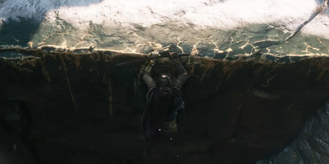
This is where I think FromSoftware's approach in Sekiro: Shadows Die Twice was a stroke of genius. Instead of garish yellow, they used something far more elegant and diegetic: white chalk. It wasn't paint slapped on by a developer; it was a subtle mark left in the game world itself, hinting at paths for the shinobi. It guided you toward ledges you could grab and cliffs you could scale, all while feeling like a natural part of Sekiro's environment. This was a perfect match for the game's revolutionary movement—the dedicated jump, the grappling hook, the fluid parkour. The chalk didn't yell; it whispered.
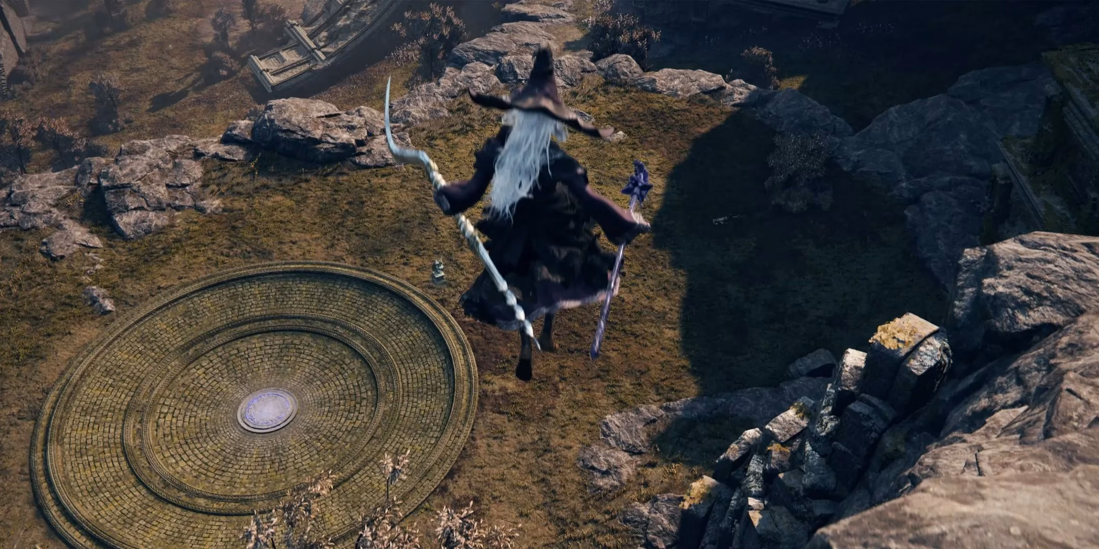
And guess what? That brilliant idea didn't stay in the past. It's evolved and found a perfect new home in the latest sensation, Elden Ring Nightreign. Now, if you haven't played it, let me set the scene. It's not your typical, leisurely Elden Ring adventure. This is a roguelite spin-off with a brutal battle royale twist—inspired by mechanics like Fortnite's Ring of Fire. You've got three in-game days before the circle closes in on a final boss zone under an Erdtree. Get caught outside? You're taking constant damage. So, the pressure is always on, and exploration needs to be fast and fluid.
This high-stakes environment demanded a rethink of traversal. The developers made some key changes to keep the pace frantic:
-
No Fall Damage: Fall into a ravine? No problem. Just keep moving.
-
Full Parkour System: Vaulting, climbing, and leaping are core to survival.
-
Pre-Revealed Map: All points of interest are marked from the start.
But with this freedom came a new challenge: how do you stop players from getting trapped in a canyon as the deadly circle approaches? The answer, once again, was the subtle language of white chalk. They brought back Sekiro's visual vocabulary, but integrated it into Nightreign's own grim aesthetic.
Look at the image above. See those grave markers stacked against the cliff face? That's not just macabre scenery. That's your way out. The white chalk scrawled along their edges is your silent guide. Up close, the marks are clear, but from a distance, your brain starts to subconsciously recognize the pattern: "Piled graves + white streaks = escape route." After just an hour of play, you're not even consciously looking for paint; you're reading the environment. You see a certain rock formation or a specific arrangement of ruins, and you just know it's climbable.
Isn't that the goal of all good game design? To teach the player a visual language so well that the guidance becomes invisible? The white chalk in Elden Ring Nightreign achieves this beautifully. It makes the fantastic parkour movement feel intuitive and earned, not just a button you press near shiny objects. It respects the player's intelligence and preserves the game's somber, immersive atmosphere.
So, let's compare the two approaches, old and new:
| Feature | "Yellow Paint" (Traditional) | "White Chalk" (FromSoftware's Evolution) |
|---|---|---|
| Visual Prominence | High-contrast, often unnatural | Subtle, designed to blend with the environment |
| Immersion Factor | Can break the sense of realism | Feels like a part of the game world's own logic |
| Player Reaction | Often criticized as being too obvious | Generally praised for being clever and subtle |
| Example Games | Horizon Zero Dawn, RE4 Remake | Sekiro, Elden Ring Nightreign |
In the end, the journey from glaring yellow paint to subtle white chalk represents a broader trend in game design. It's a move away from overt hand-holding and towards environmental storytelling and intuitive visual literacy. As players, we're becoming more sophisticated, and games like Sekiro and Elden Ring Nightreign trust us to keep up. They offer clues, not commands. And for me, that makes discovering a hidden path or a secret escape route all the more satisfying. After all, finding your own way in a hostile, beautiful world is what these adventures are all about, isn't it? 🧗♂️✨